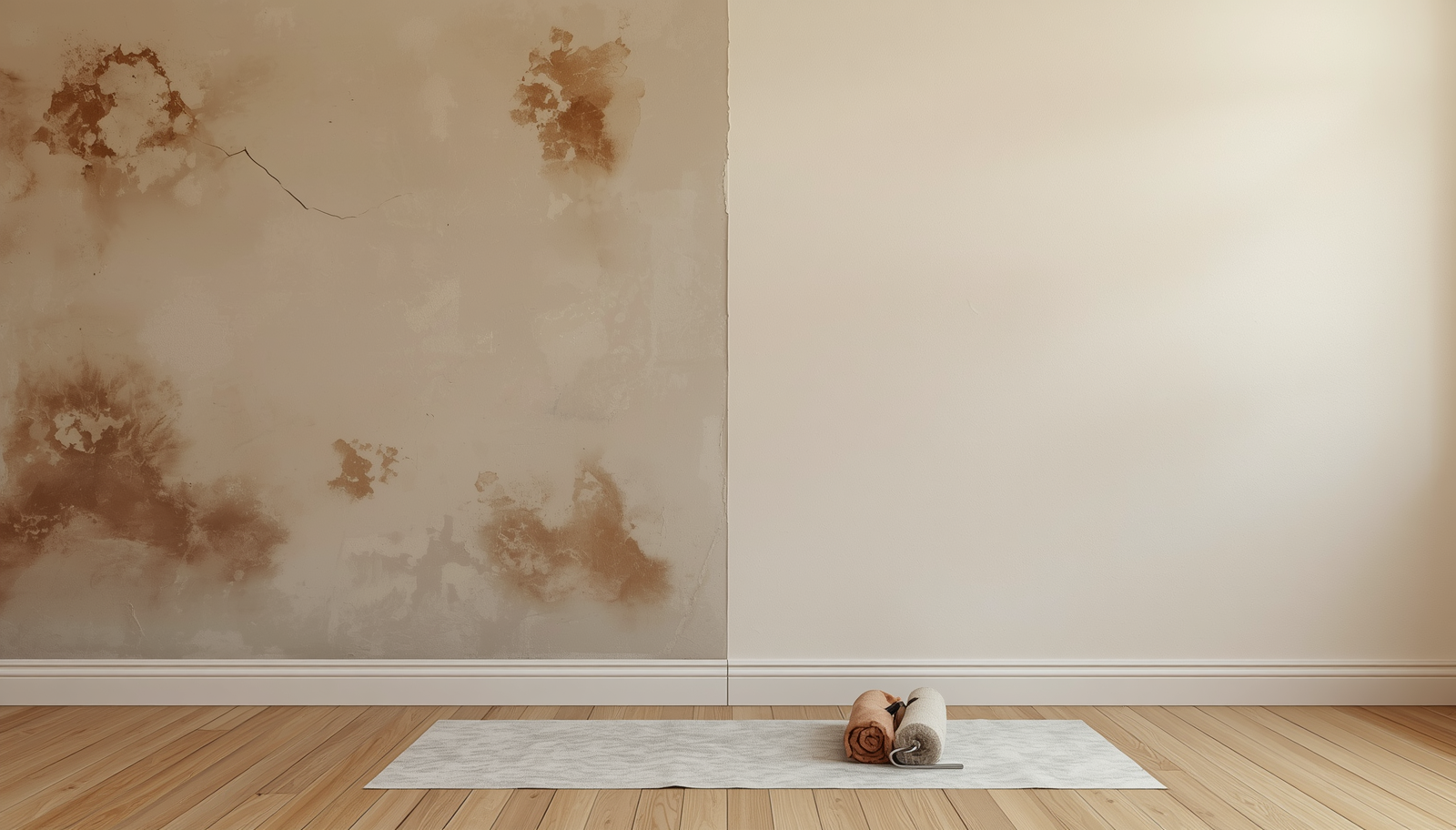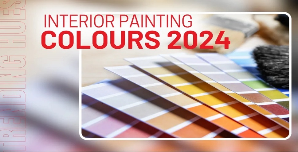
Colour is a dynamic tool in interior design that can be used to express individuality and set the mood of a room. Keeping up with the most recent colour trends is certainly important if we want to create spaces that appeal to modern sensibilities as we navigate the constantly changing terrain of aesthetic preferences. Here, let’s discuss the colour selection process, top trending hues, and their importance in interior painting and design.
The Importance of Colour Selection in Interior Painting
Hues and colours can make or break our desired ambience and theme for a certain room. Colours convey feelings and establish the mood of a space. The colours you choose will determine whether you want a calm, lively, or intimate space. You can also create a fun and inviting environment with the use of bright colours.
For example, pastels will look good for the baby’s room, playrooms or a girl’s bedroom. Patterns can be used to create a retro vibe. Here are some more colour trends to think about when you are planning to paint your room or some part of the house.
Top Trending Hues for Your Interior Painting Project
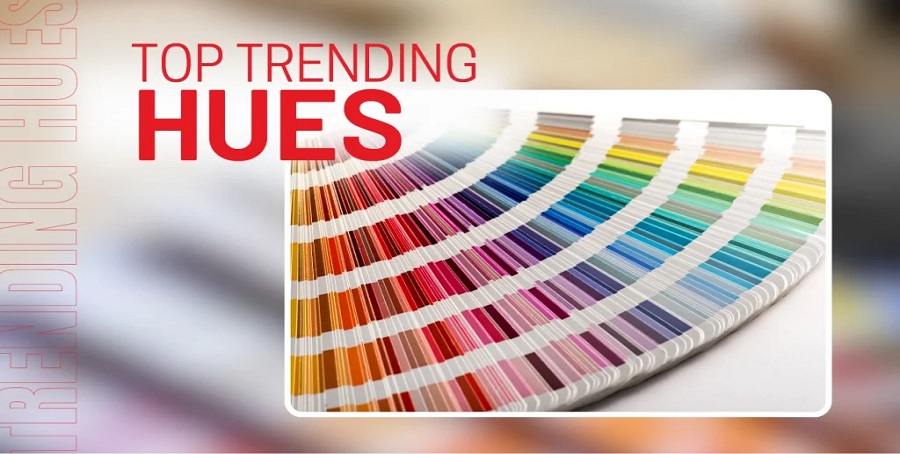
The following are some of the inspirations that you can use when selecting the colours for your interior painting project.
Earthy Tones: Olive Greens, Warm Browns
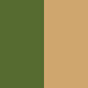
A versatile earthy tone that pairs well with neutrals and other greens. Earthy tones remind us of lush groves, serene forests and natural foliage. It promotes calmness and tranquillity and can easily match wooden furniture.
Soft Pastels: Dusty Pink, Baby Blue

A versatile earthy tone that pairs well with neutrals and other greens. Earthy tones remind us of lush groves, serene forests and natural foliage. It promotes calmness and tranquillity and can easily match wooden furniture.
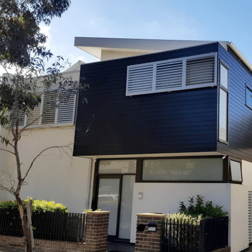
Bold Monochromatics: Deep Blue, Charcoal Grey

Have you noticed how dark colours add a touch of elegance to a room? Well, that is because charcoal grey provides depth and drama, while deep blues radiate refinement. We would find shades of charcoal grey in a boy’s or bachelor’s bedroom. You can add an accent to a grey room. But it depends on the vibe and ambience you’d like to achieve.
On the other hand, deep blue gives a touch of mystery and elegance. It will go well with silver or metallic accents in the room.
Nature-Inspired Neutrals: Stone Grey, Moss Green

These vibrant hues provide a focal point. Emerald green seems opulent, and sapphire blue radiates wealth. Neutrals with a natural feel, such as moss green and stone grey, bring the beauty of the outside indoors, fostering a sense of balance and tranquillity.
These adaptable colours go well with many different colours and design elements. They may be used in any space during your house painting job. Nature-inspired neutrals lend a timeless elegance to any environment, whether they are utilised as the primary palette or as a backdrop for striking accent pieces.
Vibrant Jewel Tones: Sapphire Blue, Emerald Green

Vibrant jewel tones, such as emerald green and sapphire blue, give any area a hint of extravagance and grandeur. These vivid and rich colours provide the impression of depth and richness, which makes them ideal for glitz and drama. Jewel tones give a feeling of sophistication to any environment, whether they are utilised as the primary palette or in modest quantities.
Soothing Blues and Greens: Aqua, Teal

Any room can be made to feel peaceful and tranquil by using soothing blues and greens like aqua and teal!
These cool colours inspire the peace of the ocean and the splendour of the natural world. They foster a soothing and restful ambience. Calm hues of blue and green, whether utilised in living rooms, bedrooms, or bathrooms, evoke a feeling of serenity that enhances our overall well-being and even lifts the mood.
Warm Creams and Beiges

Beiges and warm creams are ageless favourites that never go out of style.
These flexible neutrals are ideal for creating a warm and inviting ambience since they exude cosiness and warmth. Warm creams and beiges give a feeling of solace and refinement to any decor, whether they are used as the primary colour scheme or as accent colours.
Bright Yellows and Oranges

Vibrant oranges and yellows give every room a burst of vitality and colour. These happy colours are ideal for creating a bright and lively ambience since they evoke feelings of warmth and enjoyment.
Bright yellows and oranges also radiate a feeling of brightness and optimism to any design, whether they are intended for dining areas, kitchens, or home offices.
Muted Terracotta

Any environment is enhanced by the earthy and warm tones of muted terracotta. This colour scheme works well in any room of the house because it goes well with so many different hues and styles. Muted terracotta lends comfort and character to any room.
Luxurious Metallics: Gold, Bronze
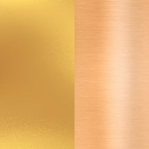
Exquisite metallics, such as bronze and gold, give any area a sense of refinement and glitz. These glossy, rich colours give off richness and extravagance, which makes them ideal for bringing drama and grace to any setting.
Embraced as the primary palette or in tiny quantities, opulent metallics provide an air of quiet sophistication and richness to any interior design.
Conclusion
Colour rules the home design industry. The colours you decide on for your interior walls can have a significant effect on how your house looks and feels. It practically affects everything from the ambience and mood to the general style and aesthetic.
The most important thing is to choose colours that speak to you and express your own sense of style and preferences, whether that means going with earthy tones, delicate pastels, striking monochromatics, or any other hue on the colour wheel. Thus, don’t underestimate the significance of colour when choosing the next time you take on an interior painting project!
After all, it’s the quickest and most straightforward approach to turn your place into the house of your dreams. If you need more help and colour consultation advice, don’t hesitate to seek professional advice and help from our licensed professionals.