Shall we refresh your walls for a new beginning? A fresh coat of paint can shape the mood, light and resale appeal of your property. It can transform the vibe of your home and create a strong impression on would-be buyers.
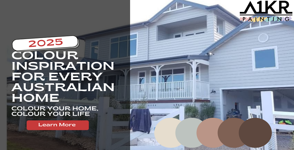
The only problem is that with so many selections, it’s rather difficult to find the ideal paint pairings. Where to start? In this article, we will let you in on the 2025 dream home colour combinations for exteriors, interiors, and different Aussie styles.
Why Colour Pairing Is More Than Just Preference
House painting is not about picking your favourite colours, but what works in the overall scheme.
Sunlight and Lighting in Australian Homes
Australia has intense sunlight, experiencing the highest solar UVR on the entire planet. This affects the behaviour of the paint’s colour, texture and overall aesthetic throughout the day.
Materials and Architecture Influence Good Colour Pairings
The perfect palette combo needs to accommodate the architectural style of your home and not clash with it. Whether it’s modern or coastal, your house’s features should coexist harmoniously with the colour pairings.
Personal Style vs. Market-Ready Appeal
Your personal style and market appeal should be weighed equally. Pick colour pairings that appeal to your prospective buyers without sacrificing your individual aesthetic.
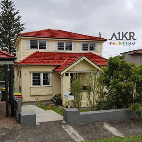
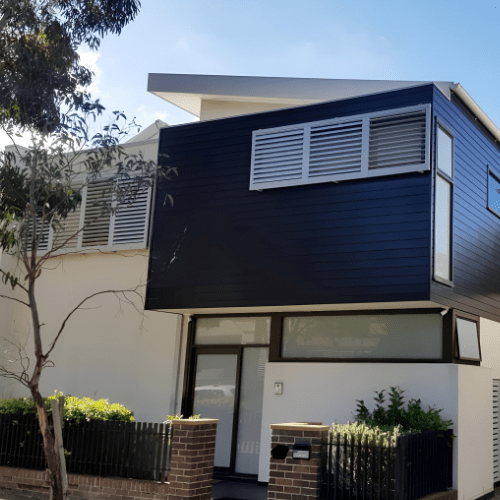
Top Exterior House Paint Colour Combinations
Australians look into the sunlight, against gardens and timbers to compose a stylish but cohesive living environment. Their paint colours work best with Federation homes or new-build residences with bigger spaces. Check out the top paint colours for Australian homes, compatible with exterior colour schemes.
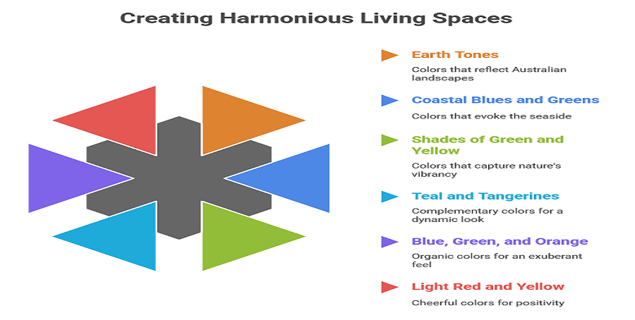
Earth Tones
Earth tones such as terracotta and sandy beige are the perfect hues to represent the Australian deserts and ragged landscapes. These authentic colours are calm and serene, with timeless appeal. They are a good touch to bring the backcountry to the city’s modern homes, creating a grounding space for your haven.
Coastal Blues and Greens
Australia is an island continent, surrounded by big bodies of water. To channel that seaside life, colour your exterior with shades of soft green and aquamarine. These colours embody the coastal charm, infusing a light and airy atmosphere into your coastal retreat.
Shades of Green and Yellow
Wildlife thrives, and unique flowers bloom incessantly in Australia. From muted green and soft grey to bright yellow, you can echo the spirit of nature into your home’s exterior.
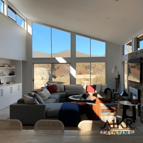
Trendy and Balanced Interior Colour Matches
From the bedroom to the kitchen, these combinations can transform your interior space into a mood you want to live in.
Teal and Tangerines
These complementary hues also look good in contrast. It’s a beautiful and sleek combination for a bright, open and dynamic look.
Blue, Green and Orange
You can mesh these shades and add an organic and exuberant look to your space.
Light Red and Yellow
These colours together make everything explode, igniting cheer, positivity and excitement in a room. When you match colours, pair them up to create a certain mood. Be intentional in designing a space that will feel good to you.
Matching Colours with Your Home’s Architectural Style
- Federation homes feature bricks, timber and marble with ornate detailing. The heritage colours to highlight the distinct colours of federation houses are emerald green, warm creams and rich red.
- Hampton-style homes combine natural light with white walls and open spaces. The typical Hampton-style colour schemes embrace neutral tones, greys and soft whites with timbre accents.
- Modern homes epitomise clean lines and sophistication. They have a minimalist canvas defined by bold black trims and monochromatic palettes.
- Coastal homes embody beachside life. They take cues from the breezy vibe of the coastal landscape, like nautical blues, easy-going whites and sandy neutrals.
Practical and Aesthetic Harmony
In Australian homes, colours can vary significantly depending on the light of the day. That’s why you must know your home and the light inside for a satisfying painting result.
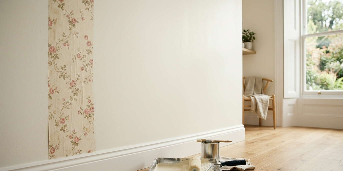
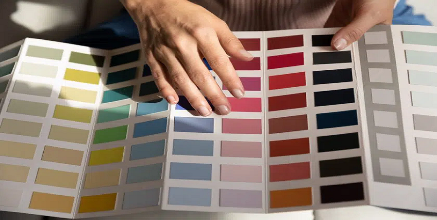
Don’t Guess—Test!
Don’t rely on just a colour swatch; test the shades in real life and see how they match up with the surroundings and the natural light.
Buying Sample Pots
Sample pots can be an excellent way to test your colour pairings without using an extensive amount of paint. It’s a really small investment that can help you decide on the right shades and avoid costly mistakes.
Painting on Large Cardboard for Mobility
Rather than painting your walls directly, try it out on large cardboard. It is a versatile way to view the colours in different areas of your house. This way, you can see how they appear in various settings and lighting conditions.
Observing at Different Times of Day
The colours will look different depending on the time of day, from the morning and midday to late afternoon.
Comparing Under Natural and Artificial Light
Compared to the rays of the sun, artificial lights are more controllable. Meanwhile, natural light leaves glares and shadows on your paint colours. So, pay attention to how the hues react to the different lights.
Let the Professionals Help You Get It Right
A One Korean Painting brings real-world colour experience. Our team of experts understands how the colours behave in different settings, from the shifting natural lights to the surrounding layout.
No matter the size of the project, we deliver fast and precise service tailored to your very specific house painting needs. We don’t do guesswork—we rely on trusted techniques and quality materials to get the job right the first time.
Conclusion
From tangerines and earth tones to terracotta, all these colour combinations will do right by you. If you know how to work them with other hues, they can boost your space, style and value.
While these pairings can turn your space into a visual masterpiece, don’t just follow trends. Find the perfect fit for your home—blend palettes that speak to you. To help you with the challenge, talk to one of our experts. We can advise you on colour combinations that work beautifully for your home in 2025.